
Batter up: new City Connect jerseys step up the plate this MLB season
A ranking of the strike-outs and home runs among these new edition of uniforms
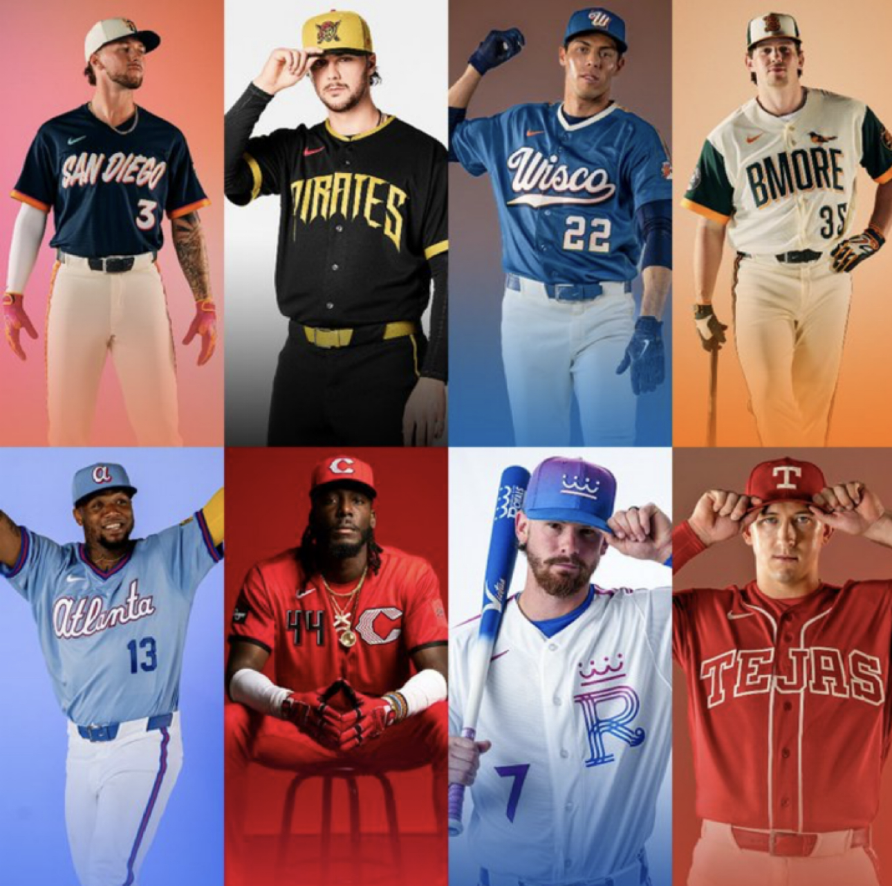
Photo courtesy of MLB/X
To add even more excitement to start this year’s Major League Baseball (MLB) season, eight new City Connect uniforms are set to debut. Teams receiving these new threads include the Atlanta Braves, Baltimore Orioles, Cincinnati Reds, Kansas City Royals, Milwaukee Brewers, Pittsburgh Pirates, San Diego Padres, and Texas Rangers, as according to YahooSports.
Since 2021, as per ESPN, “Nike has worked with MLB teams to create a uniform that reflects each baseball city's culture and community.” While all the City Connect jerseys reflect their team’s city and history, only some deserve a spot in the lineup. Here is my ranking of Nike’s 2026 City Connect jerseys.
In last place: The Pittsburgh Pirates
These are a swing and a miss. MLB described these black and gold jerseys as “intentional,” saying the uniform colors represent “Pittsburgh’s sports culture… where all the professional sports teams wear the same colors [and] black and gold are part of the identity that connects the Pittsburgh community.” The uniforms are exactly that: familiar. City Connect jerseys should tie the city into the sport, not just reflect other sports teams from the city. The pirate logo on the sleeve of these jerseys, described by MLB, “is inspired by the history of the team, the spirit of a pirate.” Why spend time and energy creating a new jersey just to put a barely reimagined version of their usual logo on the sleeve?
Seventh place: The Kansas City Royals
The pinks, purples, and blues of these uniforms stand out; MLB documented that the colors are meant to represent “tones of a Midwestern summer sunset and the blue of water flowing through Kansas City’s more than 200 fountains.” That was a success, another success: the “white line around two vertical stripes on the armbands… symbolizing the Royals’ and Kansas City’s unique position along the state lines between Missouri and Kansas,” as explained by MLB. The idea of these jerseys made it to first base, but the execution did not quite make it home. The newly imagined logos on the chest and hats of these uniforms feature swirled lines and a curly ‘R’. Meant to “[blend] the roots of the franchise [previous logos] with modern tradition,” as said by MLB, the logos ended up looking like a cheap, Royals jersey knock-off.
Sixth place: The Texas Rangers
These jerseys had potential; the idea seemed to go foul. The Rangers unveiled their new uniforms on Instagram, via a joint post between MLB and the team. Reading ‘TEJAS’ across the chest, and incorporating artful designs around the sleeves, “these new threads… celebrate the passion of art, music, dance and Tejano culture,” as per the Instagram post. I appreciate the effort to relate the jerseys to Texas’s rich Spanish culture, but with that being the goal, these jerseys should have been less simplistic.
Narrowly escaping the bottom three: Cincinnati Reds
These uniforms are all red—no creativity. On their official website, the Reds detailed their new threads, saying, “In Cincinnati, red isn’t just a color. It's an identity. We have always been, and always will be, a baseball town.” I have a similar critique of these uniforms as I do for the Pirates: Nike had an entire city to connect with, and they chose one color to do it. However, unlike the Pirates’ jerseys, the sleeve patch depicts Fountain Square, a historical landmark in Cincinnati, and “the sleeve is a darker shade of red and the jersey’s pinstripes intentionally cut off at the shoulder, a nod to the popular vest-style uniforms last worn two decades ago,” also according to the Reds’ website. However, I wish the sleeves were a darker red to really turn this execution from a single to a home run.
Next: The Milwaukee Brewers
These jerseys are almost great, but they seem to have blown the save in the ninth inning. They continue Nike’s trend of using colors as a main connection to the cities, but the execution was better here than for other teams. OnMilwaukee, an independent Milwaukee publication, documented these light blue uniforms as representing “the state’s lakes and rivers, while a cream accent color is meant to be a nod to sandy shores and sandstone bluffs found across the state.” This design is a hit; it is a color combination that has real meaning and looks nice. The “Wisco’’ letters across the chest pay “homage to the American Association Milwaukee Brewers baseball club of the early 20th century, and a wheat and barley braid” is sported in connection with Milwaukee’s rich history of agriculture and brewing. Visually, they fall short when compared to other jerseys, but the city connections are strong.
Beginning the top three: San Diego Padres
NBC7 San Diego highlighted these new uniforms’ deep connections to Latin American and Caribbean cultures, with “a patch [on the sleeve] depict[ing] a flowery ‘La Catrina,’ making the Padres the first major North American sports franchise to have a female representation on their official uniforms.” Breaking barriers, looking sharp on the diamond, and representing the city’s culture: these uniforms are a grand slam.
Runner-up: The Atlanta Braves
No curveballs—these are great jerseys. Fanatics described the nostalgia these uniforms invoke: “This… jersey takes you back to a time when the Braves emerged as ‘America's Team.’ Owner Ted Turner also owned TBS… and began broadcasting their games to a national audience in 1976.” Also highlighted by The Braves via Instagram, the uniforms feature “a new ‘ATL’ block letter sleeve patch reminiscent of the old [1970s] logo.”
The MVP: The Baltimore Orioles
These uniforms honor Baltimore’s baseball history, connect traditions to modern-day baseball, and knock it out of the park visually. “A special patch on one of the sleeves… mimics the home run plaques on Eutaw Street,” commemorating players who hit balls out of the park at Camden Yards, and are celebrated with a plaque on the street right outside the Baltimore ballpark, as explained by BleacherReport. New Era Caps added, “the green and orange colorway and brick patterned font pays homage to the architecture and history around Camden Yards.” The design shows true attention to detail; the “BMORE” letters across the chest with an oriole perched upon the letters highlights the historic color scheme while staying true to the team’s identity today, and are just as beautiful as a crisp swing of the bat for a go-ahead home run in the eighth inning.